Panaria Ceramica: the best for the home has a new logo
Welcome to a new page in Panaria's history
Panaria Ceramica, a historical Italian brand and for almost 50 years a benchmark in the ceramic sector for floor and wall surfaces, has renewed its logo with a significant change that aims to relaunch the inheritance and heritage of reliability and brand credibility projecting the company towards the present and future challenges.
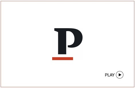
The restyling repositioned the brand's iconic orange square at a different viewpoint. The square now supports, with distinctiveness yet elegance, the unique letter P. The rebranding gives Panaria that dynamic, contemporary, fascinating personality that the market already knew and that can now find again with new traits.
The new logo tells of a brand that through its know-how and reliable production history continues to renew itself, keeping pace with the times, the latest trends in the home world, and the styles of its consumers. A further element of the company path oriented towards a continuous evolution of the product range can now also be found in the brand identity.